Toronto After a Decade of Austerity – January 2020 report from Social Planning Toronto

Source: page 21, How Much Is Enough? (2019). Credit: Warren. The photo is from a previous post: One in two households earn less than a living wage in Perth & Huron. These photos, taken by residents, underline the impact of low incomes
I lived in Toronto from 1975 to 2018. We now live in Stratford.
Occasionally we meet people who have homes in both Toronto and Stratford. We live solely in Stratford, having sold our house in Toronto.
We enjoy visiting Toronto and have also settled in at Stratford.
The current post has to do with demographics. A recent post about this topic is entitled:
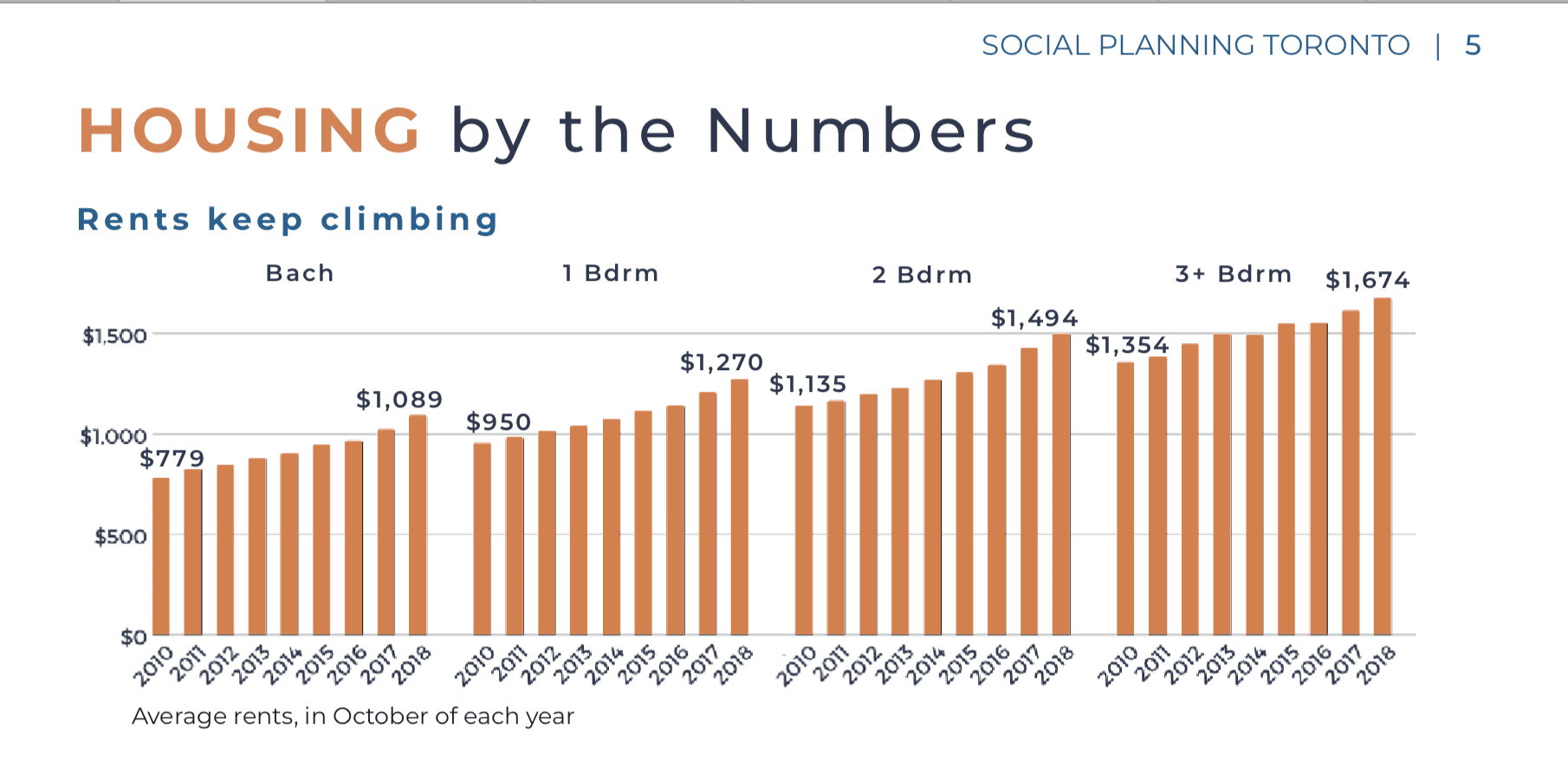
Source: Toronto After a Decade of Austerity: The Good, the Bad, and the Ugly, Social Planning Toronto, January 2020 (p. 5)
The current post features a report from Social Planning Toronto entitled: Toronto After a Decade of Austerity.
Introduction – Toronto After a Decade of Austerity (Social Planning Toronto)
An excerpt from the report’s Introduction (p. 3) reads:
Welcome to 2020! As we look ahead to a new decade and the launch of Toronto’s 2020 budget, we decided to take stock of Toronto at the end of the ’10s, so that we may learn from the past and chart a new path forward.
Recent reports have made it clear that rising income inequality is creating an increasingly divided city.
In May 2019, United Way Greater Toronto released its “Rebalancing the Opportunity Equation” report, which illustrated that growing income inequality is undermining the promise that “diversity is our strength”:
The opportunity equation – individual effort plus access to opportunity equals success – is working for some but not for all. Young people, immigrants, racialized people, and women are seeing that their circumstances – the things about themselves that they cannot control (such as their age, immigration status, whether or not they belong to a racialized group, their gender, and even their postal code) – are barriers to their success in today’s GTA. These groups have to work harder to achieve the income needed to thrive, and the situation is worse in the Toronto region than it is in the country as a whole.4
A few months later, the Toronto Foundation released its 2019-2020 “Vital Signs” report. It too confirmed Toronto’s status as Canada’s income inequality capital, with net worth for the bottom 20% increasing by only $2,100 between 1999 and 2016, while the top 20% enjoyed an average increase of more than $600,000. The report pointed out that even though Toronto “is on a roll” economically, rising income inequality is at the root of disturbing trends. As stated in the report:
When we probe the numbers more closely, we see a profound pattern of maldistribution. Despite our self-image, Toronto does not work for all. In fact, for a growing majority, life in the city poses a serious struggle, and the trend lines suggest things will get worse before they get better.5
Most recently, the Metcalf Foundation’s “The Working Poor in the Toronto Region” report showed a significant increase in working poverty from 2006 to 2016 despite strong 2016 employment figures. It too points to growing income and wealth inequality, and illustrates what this means for our quality of life as Torontonians:
The convergence of low pay, multiple insecure jobs, long hours, and gruelling transit trips, all in the face of higher costs for necessities, push the working poor to a life on the precipice of vulnerability where few have any sort of financial cushion.6
Commentary
It is noteworthy that information in the document focusing on Toronto is tightly written – by which I mean it is comprehensive yet succinct – and is laid out in a two-column format that makes it easy to read.
The text is also strongly evidence-based and the document features effective data visualization.
This is a valuable report and is well worth a close read – no matter where in the world you may be living.
The Perth-Huron report, which documents the same state of affairs in Southwestern Ontario, strongly contributes to the narrative using photographs from residents to portray the widely shared experience of living on less than a living wage.
I have included such a photo at the current post.
Leave a Reply
Want to join the discussion?Feel free to contribute!