Data visualization shared by David Pritchard of Ottawa helps us better understand what is going on with COVID-19 in Canada, as compared to the United States
What follows below – all of the images and text that you see – is from a pinned Twitter thread by David Pritchard of Ottawa. What the thread underlines is that data visualization can do a tremendously valuable job in telling us some of the things that we can learn from data.
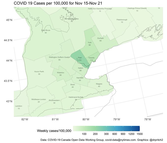
2/ This is what we think about in Ontario right now. Peel: nearly 200 weekly cases/100k population. Toronto: also in lockdown. The rest of the Greater Toronto Hamilton Area, in the 50-110 bracket, above the red “Control” threshold of 40.
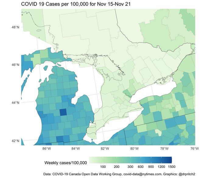
3/ Of course… if we look a bit further afield, we see that New York State – one of the states doing the best at fighting COVID-19 – has a ton of regions in the 2-3x Toronto ballpark. Buffalo is at 340 weekly cases/100k, Rochester at 240.
4/ Now take a breath. Detroit, Cleveland, Flint and their suburbs are in the 400-500 weekly cases/100k range. Michigan’s Upper Peninsula bordering Sault Ste. Marie is also high, but least sparsely populated.
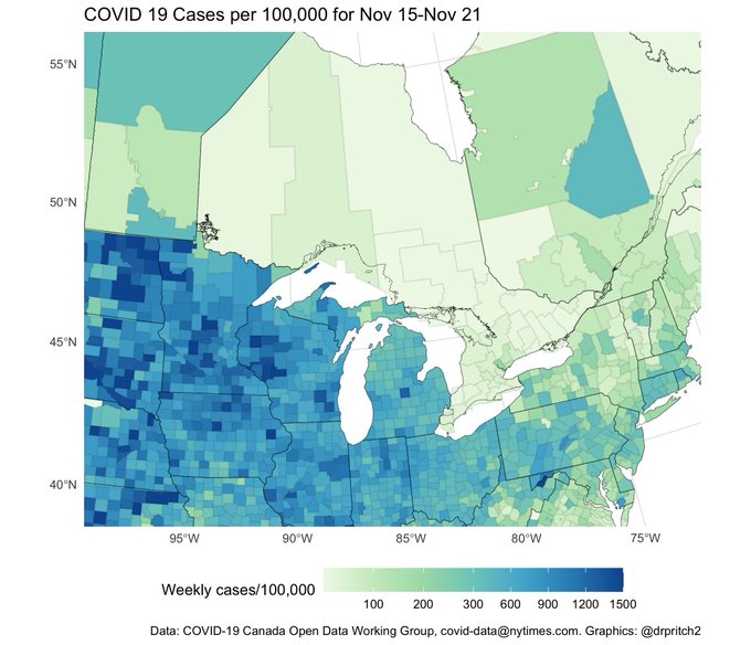
5/ When we pull back and look at Ontario in full: it starts to become obvious that it’s an island of relative stability next to a sea of COVID. The scale here is non-linear: that’s 7-8x higher rates than Peel, showing up in NW Minnesota up against the Manitoba border.
6/ Ontario’s COVID response had a turbulent month. The government floated “living with the virus”, set high lockdown thresholds, but then backed down and “did the right thing, once all other options were exhausted” (again). Where did “living with virus” talking points originate?
*
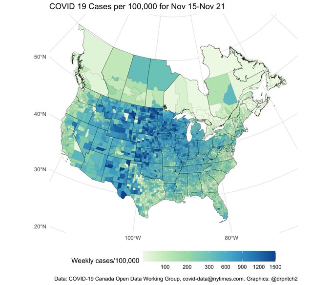
7/ Much of the USA is indeed living with the virus, not always by choice. Ontario, BC and the Atlantic provinces are still in the fortunate position of being able to choose their future. This month, Ontario chose well. Short term pain for long term gain.


Leave a Reply
Want to join the discussion?Feel free to contribute!