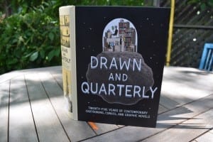
25 Years of Drawn & Quarterly, Champion of Female Cartoonists – New York Times, June 12, 2015
A June 12, 2015 New York Times article is entitled: “25 Years of Drawn & Quarterly, Champion of Female Cartoonists.”
The opening paragraphs read:
When the first issue of Drawn & Quarterly sneaked into comics shops in April 1990, it seemed as if its 23-year-old founder, editor and janitor, Chris Oliveros, was trying to single-handedly conjure a future for the testosterone-confused medium that most of his fellow fans and creators couldn’t imagine.
First, he featured a beleaguered female cartoonist on its cover, as drawn by Anne D. Bernstein. And second, he criticized in its pages the world of comics for being “a private boys’ club” that discouraged women from reading or making comics. (One contributor to D&Q No. 1 was Alice Sebold, who later wrote “The Lovely Bones.”)
So it seems somehow fitting, in a theater season in which the musical adaptation of the alternative cartoonist Alison Bechdel’s graphic novel “Fun Home” won five major Tonys, that Drawn & Quarterly is celebrating its 25th anniversary by putting out a strikingly designed 776-page book that makes clear that its rise from Montreal ’zine to well-regarded publisher of graphic novels is inextricably intertwined with the advance of women in independent comics.
[End of excerpt]
The book is available at the Mississauga Library System and the Toronto Public Library
I recently borrowed the 776-page book, Drawn & Quarterly: First Hardcover Edition (2015). mentioned in the previous paragraph; I borrowed my copy from the Mississauga Library System. The book is also available at the Toronto Public Library.
I’ve enjoyed comics books ever since (and, in fact, before) the time, as a child in Montreal in the 1950s, my dear mother told me that comic books aren’t really all that great a thing for kids to be reading. Actually, I love reading all kinds of materials, including street signs, and whatever it is that students of semiotics like to focus their attention upon, as well as comic books and graphic novels.
I am just delighted to know that there is an audience out there for such a book.
This is a perfect book to approach using Alice Munro’s method of reading a short story. That is, you can jump in at any point, and go forward of backward from there, like visiting rooms in a house. You can even start at the beginning and read through to the end. I follow her prescription for a great reading experience every time I encounter a text, whatever the text may be, including a street sign whose text is inherent in the visual image – and in the resulting message – that the sign communicates.


Leave a Reply
Want to join the discussion?Feel free to contribute!