In 1980, 2% of Peel’s neighbourhoods were considered low-income. Now, 52% of Peel’s neighbourhoods are considered low-income.
An early January (Jan. 4, I believe) 2018 tweet from United Way Peel @Unitedwaypeel reads:
In 1980, 2% of Peel’s neighbourhoods were considered low-income. Now, 52% of Peel’s neighbourhoods are considered low-income. Learn more about income inequality in Peel Region: http://www.unitedwaypeel.org/reports/Opportunity_Equation_Update-sm.pdf
I have written about income inequality at previous posts.
The tweet, that I refer to, features Map 12: Average Individual Income, Peel Region, 2015, which is what caught my eye when I read the above-noted tweet.
Map 12 is from an online PDF document entitled: The Opportunity Equation in the Greater Toronto Area: An update on neighbourhood income inequality and polarization.
It was the map – a form of data visualization – that caught my attention, and prompted me to find out more.
The “Opportunity Equation” document, which also describes trends in other areas of the GTA, in addition to Peel region (named after the British, colonial-era politician, Robert Peel), makes for informative reading.
I have posted Map 12 from the document, as well as Map 11: Annual Individual Income, Peel region, 2000.
As the maps indicate, low-income areas have grown in Peel from 2000 to 2015. The trend goes back years before that, as well.
Demographics – and in the wider sense, materiality – tends in some cases to have an impact on our worldviews, mindsets, and perceptions of everyday life. For that reason, in recognition of the role that materiality plays, I have posted these maps.
Materiality concerns itself, among other things, with dominance, power, resistance, stereotyping, and labelling.
Materiality is a feature of the Story of M, as is the case with every story on the planet.
Materiality is not the only thing that influences our perceptions and our interactions, but it does play a role.
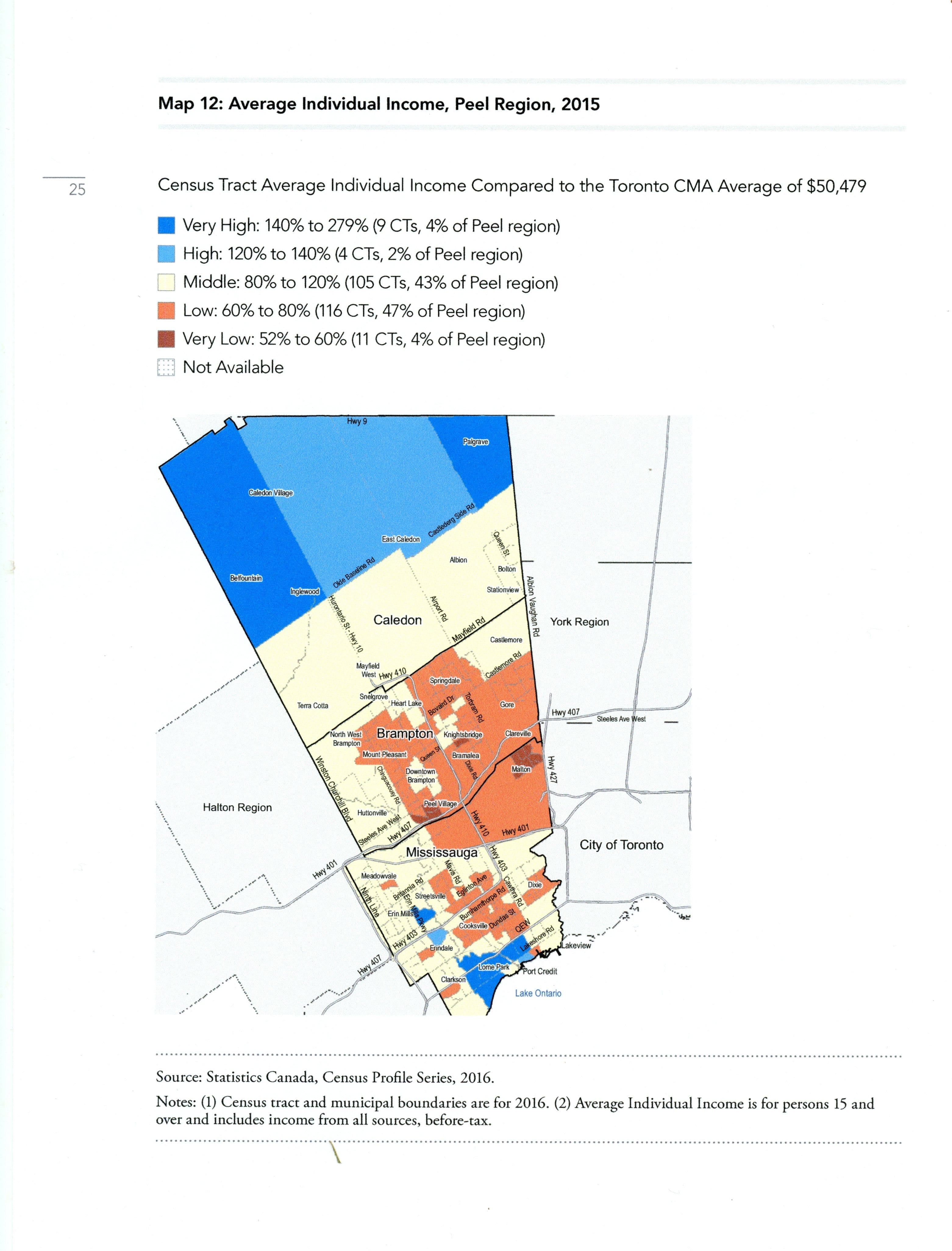
Map 12. Source: online PDF document entitled: The Opportunity Equation in the Greater Toronto Area: An update on neighbourhood income inequality and polarization. Click on the image to enlarge it; click again to enlarge it further.

Map 11: Source: online PDF document entitled: The Opportunity Equation in the Greater Toronto Area: An update on neighbourhood income inequality and polarization. Click on the image to enlarge it; click again to enlarge it further.
Leave a Reply
Want to join the discussion?Feel free to contribute!